Brilliant Future

2019 Style Guide for Brilliant Future: The Campaign for UCI

Please note that Brilliant Future The Campaign for UCI creative assets are reserved for use in fundraising material, soliciting donors or in alumni engagement. General (or the overarching) UCI brand should still be used for every day practice.

The UCI “Surge” mark represents the energy, efforts and actions of the entire UCI community in our pursuit of a Brilliant Future. The interweaving colors embody the bold diversity of thoughts and individuals that are opening the world to new paths and perspectives. And the circular motion is indicative of the collaboration that drives our constant progression toward a greater tomorrow.

Primary UCI Logo Lockup

This logo features the entire UCI Surge mark. In most instances, the Surge mark will be cropped and utilized as an accent color. While the full logo may be used where appropriate, it is to be utilized primarily as a reference for what sections and elements are available for cropping. See below for examples of cropping techniques.

Primary UCI Logo Lockup

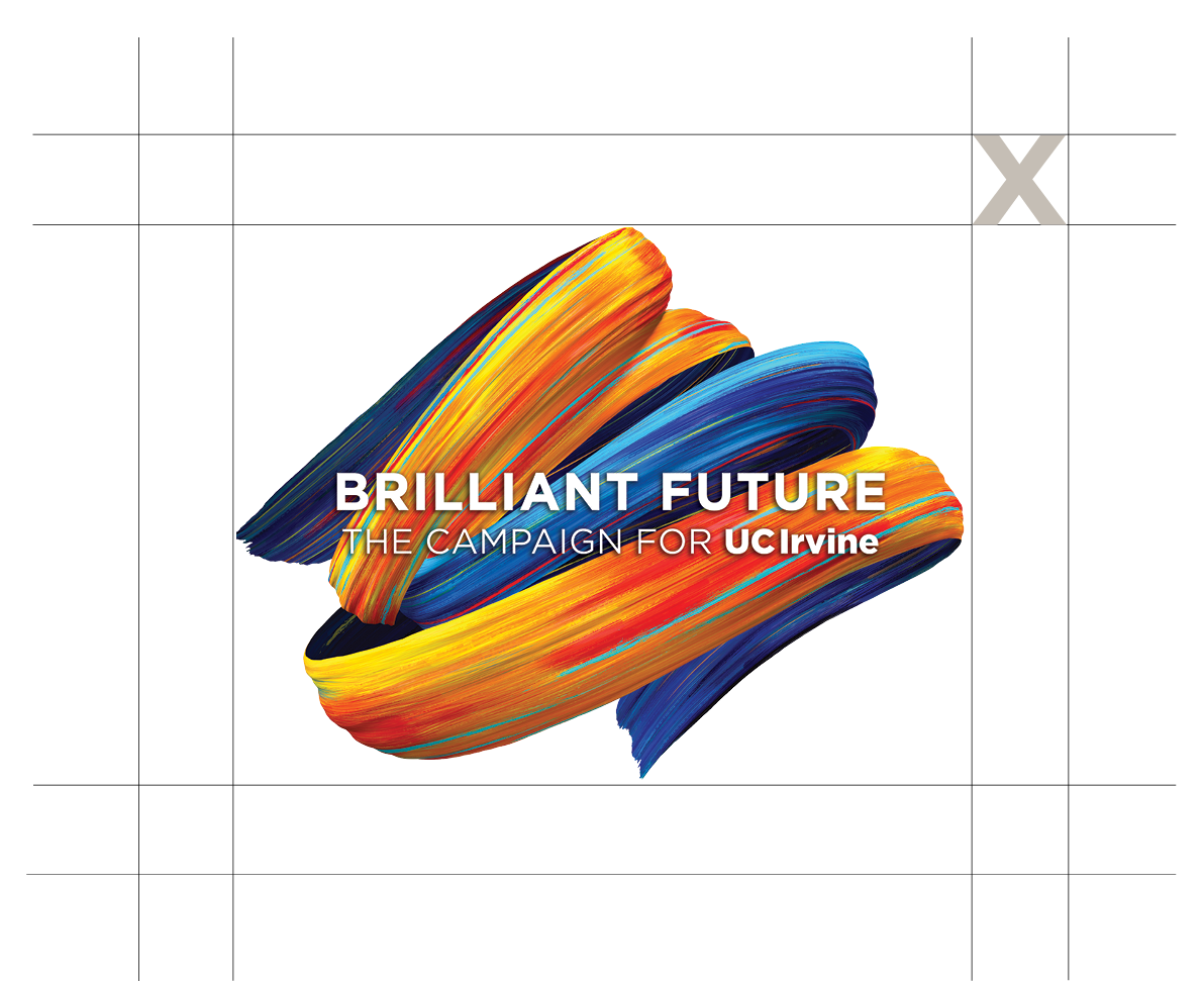
Clear Space

Always maintain a clear zone around the logo to maximize recognition and maintain integrity. These areas should never be intruded upon by any other element. This is a measurement that is equal to the width of the “U” in the Primary Identifier.

clear space

Minimum and Maximum Size

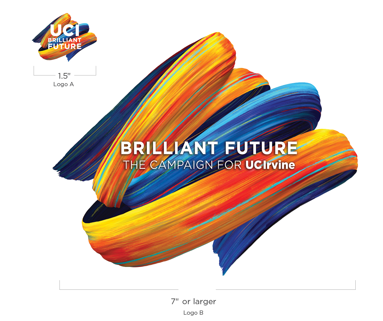
Use the correct version of the logo depending on the size of your application. For applications between 1.5 and 3 inches in width, use Logo A. If the logo application exceeds 3 inches in width, use Logo B.

The “UCI Brilliant Future” logo with text should not be displayed smaller than 1.5 inches in width.

Example: 1.5 to 3 inches

Logo (A): use for widths between 1.5 and 3 inches

Example: greater than 3 inches

Logo (B): use for widths greater than 3″


Secondary Logos

Text Lockup

A text lockup of the logo must always be used as an identifier in all “UCI Brilliant Future” communications. Variations of the text logo are provided to best complement the design of the communication piece it appears on.

Text lockups can be used in conjunction with the Surge mark as shown in instructions that follow below.

Vertical Stacked

vertical stacked example

vertical stacked example

vertical stacked example

Horizontal

horizontal example


Clear Space

Always maintain a clear zone around the logo to maximize recognition and maintain integrity. These areas should never be intruded upon by any other element. This is a measurement that is equal to the width of the “U” in the Primary Identifier.

text lockup clear space

Minimum Size

To maintain legibility of type, do not display the vertical stacked treatment smaller than 1 inch width. Do not display the horizontal treatment smaller than 1.75 inches width.

Example: 1 - 1.75 inches wide

Cropped Mark with Text Lockup

The following are examples of how the Surge mark can be cropped when accompanying the text lockup logo. When cropping, avoid showing the tapered ends of the brushstrokes in order to maintain a sense of constant motion and forward energy.

Example: Cropped Mark with Text Lockup

Cropped Mark with Campaign Lockup

When creating communications with the intent of soliciting donations, the “Campaign for” logo lockup should be used. This could apply to materials such as fundraiser invitations, digital media or support cases. Use of this logo will aid in introducing the philanthropic campaign and providing more context for our audience.

Example: Cropped Mark with Campaign Lockup

Example: Cropped Mark with Campaign Lockup

Zoomed-in Mark with Text

The following are examples of how the text lockup can be layered over a zoomed-in crop of the Surge mark. When executing this method, always crop sections that provide the most contrast for legibility of text. White text must always be used.

Example: Zoomed-in Mark with Text

Restrictions

To help maintain the integrity of the logo, follow these guidelines when incorporating it into any designs.

Do not use the logo on lighter background colors

Do not alter the logo color

Do not alter the size of UCI in relationship to the logo text

Do not stretch or alter the logo

Do not alter the logo’s typeface


Color Palette

Primary Colors

Our primary color palette consists of three colors plus black and white and should be used on all design and marketing materials, both internally and externally.

Note: PMS colors are purposefully different from their corresponding HEX values for quality purposes. Please use the PMS/CMYK values for print-quality projects and use the RGB/HEX values for any digital projects.

UCI Gold

  • PMS 109
  • CMYK 0/16/100/0
  • RGB 255/210/0
  • HEX #ffd200

UCI Blue

  • PMS 7685
  • CMYK 93/73/11/1
  • RGB 0/100/164
  • HEX #0064a4

Dark Blue

  • PMS 654
  • CMYK 100/84/31/17
  • RGB 27/61/109
  • HEX #1b3d6d

Secondary Colors

Colors from the secondary color palette may be used as complements to the primary palette.

Orange

  • PMS 715
  • CMYK 0/54/93/0
  • RGB 247/141/45
  • HEX #f78d2d

Light Blue

  • PMS 549
  • CMYK 60/24/21/0
  • RGB 106/162/184
  • HEX #6aa2b8

Light Gray

  • PMS 400
  • CMYK 23/21/26/0
  • RGB 197/190/181
  • HEX #c6beb5

Dark Gray

  • PMS 425
  • CMYK 65/56/53/29
  • RGB 85/87/89
  • HEX #555759

Web Accessability

When the colors from the primary, secondary or tertiary palettes are used on the web as background or foreground (text) colors, sufficient contrast between the foreground and background colors must be present. This may require additional lightening or darkening of your selected color. To check for sufficient contrast, use the WebAIM Color Contrast Checker.

Typography

For primary and secondary typefaces, refer to general UCI typography.

Editorial Body-Copy Typeface

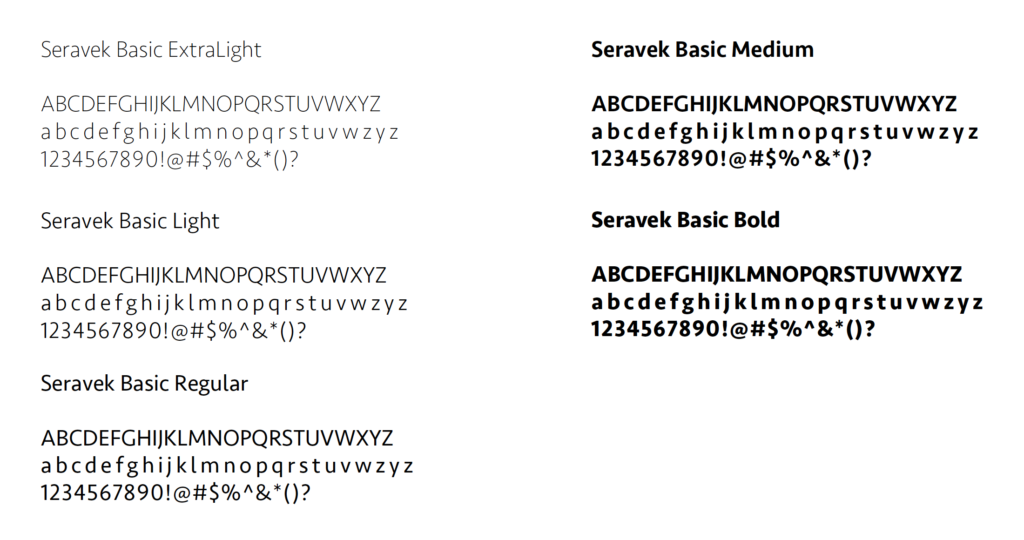
Seravek is a system font for Mac OS, but can also be purchased.

Purchase Seravek

Seravek font example

Design Element – Wave

This supplementary element has been created to add more flexibility for incorporating the “Brilliant Future” Surge mark into photos and designs. When incorporating into photos, we recommend interweaving the color wave with the subjects in the photo to provide a sense of depth. Creative examples for using the Wave mark can found in the Applying the Brand section.

UCI Brilliant Future Wave Mark


Get “Brilliant Future” campaign assets for your UCI project:

Access assets

When the link above is clicked, users will be redirected to the UCI asset management system. Only current employees with valid UCInetIDs may request access to download brand assets. If you have been approved to use our asset management system, please log in prior to accessing links for assets. If you have not been granted access, follow the directions to request access once you log-in with your UCInetID.